Parts of the Letter:
I’ve always liked typography. Even before I knew what typography was, I was attracted to simple words with a lot of space around them. The simplicity of letters and words being the most beautifully executed graphic design in itself interests me.
After reading “Parts of the Letter”, I realized that typography is essential in how we communicate. Typography isn’t just words shown in conceptual ways, typography is the creation of typefaces through differences in serif, stroke, apex, vertex, etc. The way the letters in a typeface are designed can give them very different meanings.
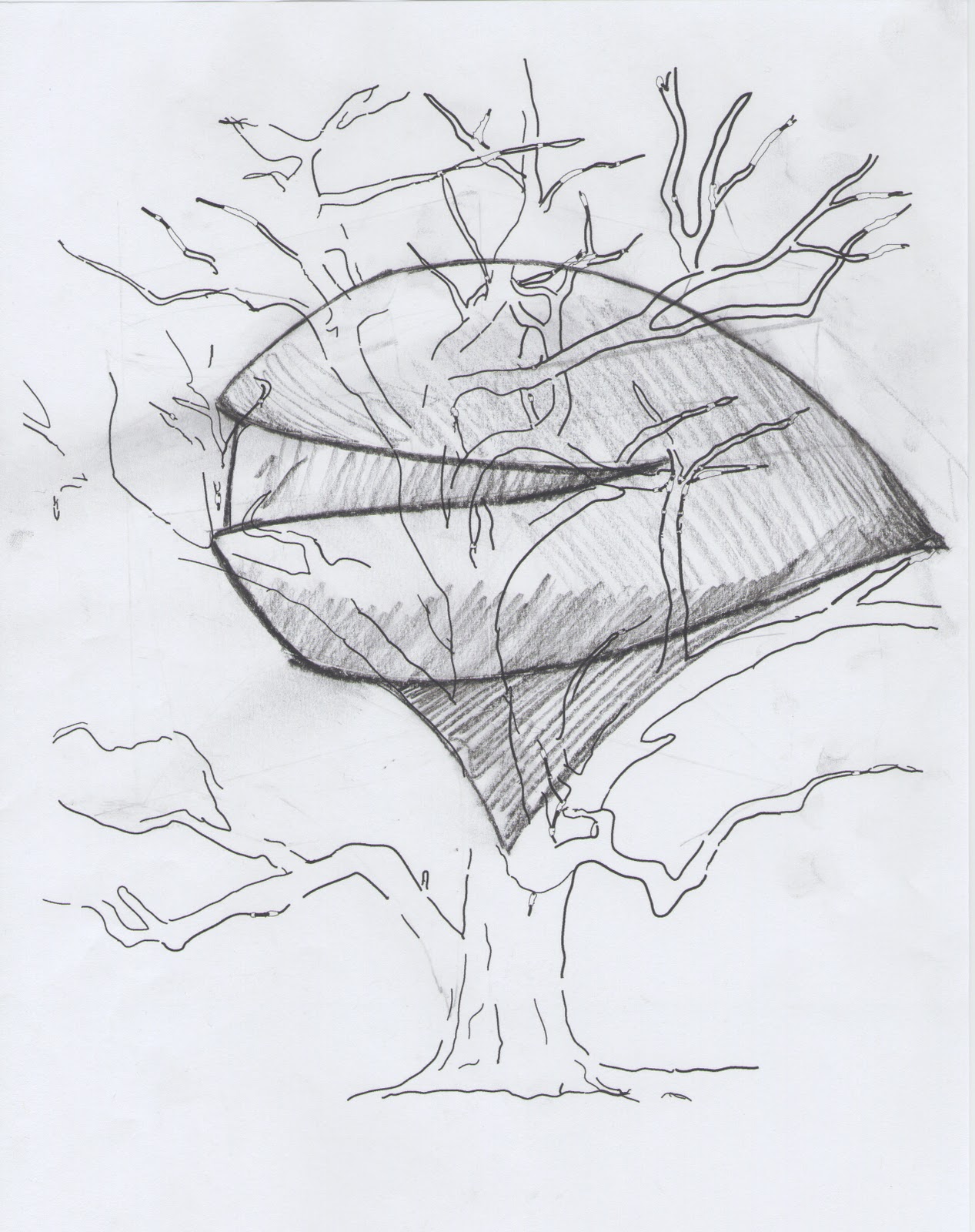
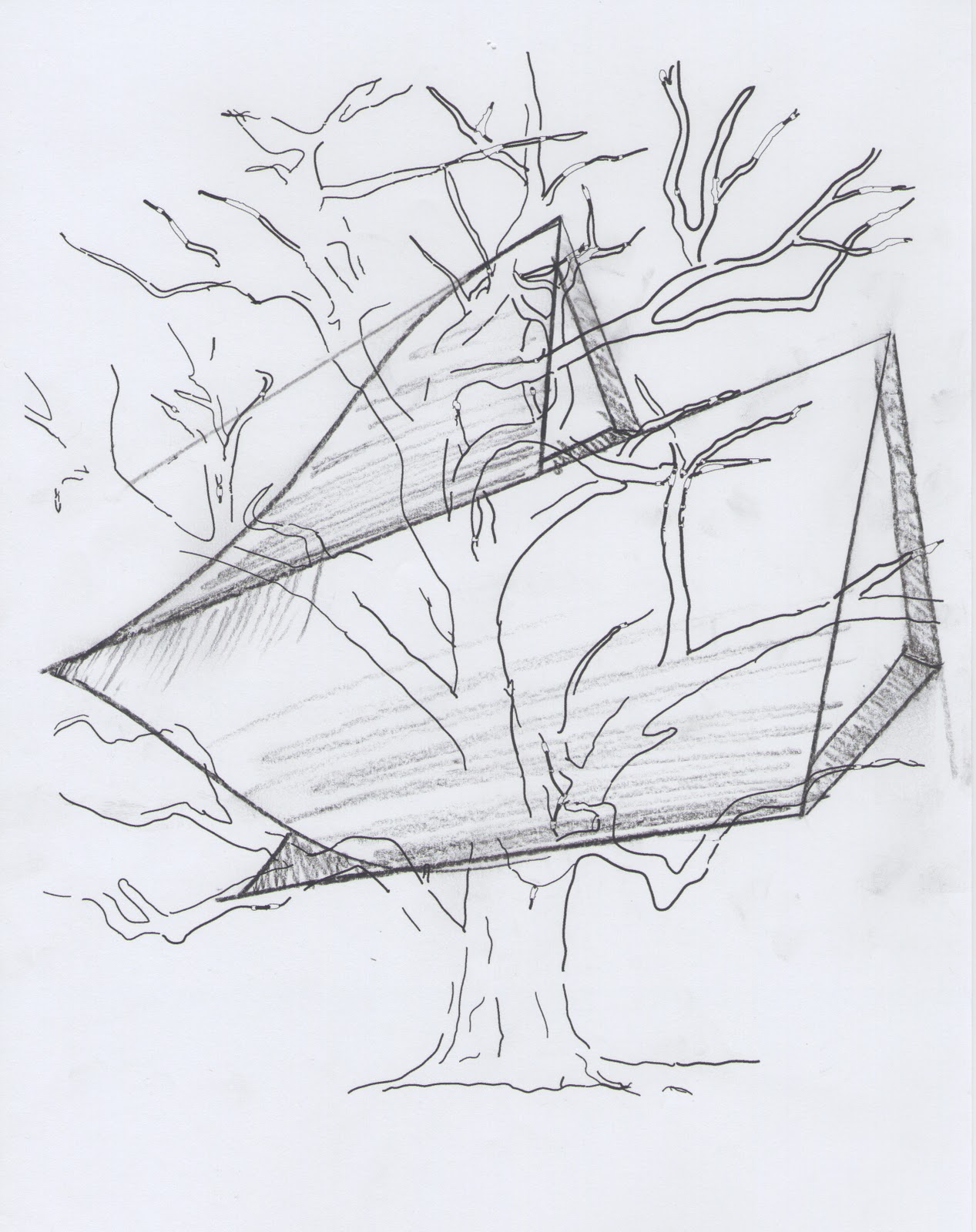
This relates to my design project in that understanding how the typeface interacts with the space around it (both two dimensional and three dimensional space) is essential to conveying its meaning.
Photography Readings:
Not to sound like the typical over dramatic art student here but: photography has been my life the past few years. I’m always looking for inspiration and any advice working professionals have to offer.
Before reading the article by Steve Edwards, I knew a little about the history of photography but not much. The criticism that photographers received in photography’s early history make me wonder how the art form gained any popularity early on. I was surprised at the huge differences between ‘art photography’ and ‘document photography’ in the mid 1800s. Photography had a bad reputation of just being a ‘copying tool’ and was not considered an art form. I was shocked to read that Ansel Adams once claimed that the photographers shooting for Farm Security Administration between 1935 and 1943 were ‘not photographers’ rather ‘a bunch of sociologists with cameras’. The documentary photos captured by such greats as Dorothea Lange and Walker Evans are some of my favorite images in history. Those images convey much more emotion in me than Ansel Adams photos of national parks, but I thats just my taste and what I personally like to shoot as well.
Photography is crucial to the project because the three dimensional words can be viewed in many different ways, but the way the group documents the word in form of a photo will depict how the word is meant to be viewed and further show how the word interacts with the environment.